Whether you love it or hate it, you probably have a very strong feeling about the notch (or, that awkward little black cutout that sits at the top of your iPhone or MacBook). The notch is a necessary evil, since, well, your front-facing camera has to go somewhere!
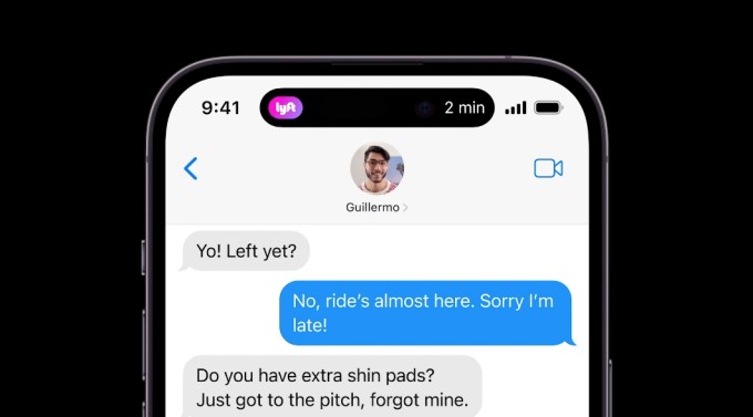
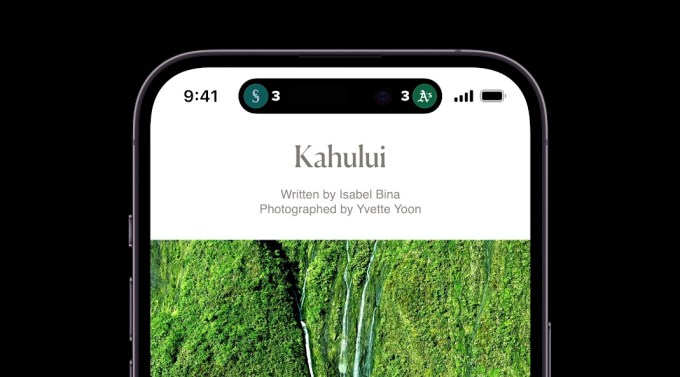
That awkward cutout is a still-awkward, pill-shaped cut-out at the top of the iPhone 14 Pro screen. But now, the notch actually serves a dual purpose. In this new design, Apple dubs the cut-out/notch a “dynamic island.”
“Our goal was to design a space that clearly and consistently surfaces alerts and background activity in a rich and delightful way,” Apple said at its fall event. “When you receive an alert, the dynamic island will notify you.”
This feature is designed to clearly present new information without distracting you from the app you’re in. In one example, someone is able to see from the dynamic island that their Lyft ride is two minutes away, and they don’t have to navigate away from their text conversation. In another use case, when you connect your AirPods, the dynamic island can also show you what percent charge your headphones are at. It’s a bit more elegant than a messy banner notification that clutters your screen.

Apple isn’t just giving the notch a purpose — it’s making the notch more prominent, rather than trying very hard to pretend it’s not there (looking at you, M1 Macbook Pro). When you get a notification in the dynamic island, the notch will appear to expand, enlarging the ovular black cut-out further out on the screen. If you have more than one background activity, the dynamic island will show both elements.

Personally, we’re just glad they went with the pill-shaped design, as opposed to the rumored “pill and hole punch” look. That one’s a little less sleek.
The iPhone 14 Pro turns the infamous notch into a ‘dynamic island’ by Amanda Silberling originally published on TechCrunch


