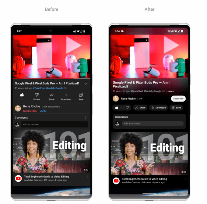
YouTube announced a makeover to its interface today, including a new look, a pinch-to-zoom feature, precise seeking, new buttons, ambient mode and a dark mode that’s “even darker.” The updates will gradually roll out to all users beginning today.
YouTube’s new pinch-to-zoom feature lets users on iOS and Android devices zoom in on videos so they can see more details. This feature was available as a test to Premium subscribers in August.
Precise seeking will allow users to easily find an exact part in a video. Available on desktop and mobile, users can drag the cursor or swipe up on the video to see a row of thumbnails. This helps users find the exact spot in the video they want to rewatch.
YouTube’s update also includes a new color effect called “ambient mode” that uses “dynamic color sampling” to match the app’s background color to the colors in the video that a user watches, Nate Koechley, UX Director, YouTube, wrote in the official blog post.
To our understanding, the new effect is very subtle and mainly for aesthetic reasons. The purpose is to draw the viewer into the content and put “greater focus on our watch page,” Koechley added.
Ambient mode will be available on desktop and mobile with YouTube’s dark theme. It’ll also be available on video playlists.
Another visual change will be new buttons under videos. YouTube links in video descriptions are now buttons in order to “minimize distractions,” the company explained. To make the page even “easier on the eyes,” the like, share and download buttons will also get makeovers and be smaller in size.
Plus, the subscribe button will now appear as a black-and-white pill-shaped button instead of the bright red “SUBSCRIBE.”
These updates are unlikely to soften the blow of the latest price hike to YouTube’s Premium subscription plan for families. The plan will increase to $22.99 per month in November.
YouTube rolls out new design with pinch-to-zoom on iOS and Android and other updates by Lauren Forristal originally published on TechCrunch


