If you told me that a company that’s charging $70 per month for multivitamins would be able to raise a $10 million round, I’d demand to see the receipts, and I’d be very curious indeed to see its pitch deck. It looks like today is my lucky day!
Rootine is the company, and the founders were gracious enough to share their pitch deck with me. Let’s figure out what the investors saw in this startup.
The company first turned up in TechCrunch’s coverage as part of the Techstars accelerator back in 2018. Anthony Ha reported that the company had 1,500 paying customers in Europe and was gunning for a U.S. expansion. It looks like that was a long journey that ultimately worked out.
Rootine’s deck is my 30th teardown — time flies! You can see the rest of them here, in case today’s read isn’t quite enough pitch decking for you.
We’re looking for more unique pitch decks to tear down, so if you want to submit your own, here’s how you can do that.
Slides in this deck
The Rootine deck consists of 29 slides, and the team tells me there have been no omissions or redactions — this is what the investors saw when they were getting pitched!
- Cover slide
- Summary slide
- Traction summary slide
- Team slide
- “Why” slide
- Market context slide
- Market size and market trajectory slide
- Problem slide
- Solution slide
- “Community enhances member experience” — community slide
- Business model slide
- “The Precision Multivitamin”— product slide
- “Supported by a variety of at-home lab tests”— product slide
- “Innovative form factor for nutrition products”— product slide
- Technology slide
- “Feedback loop”— product slide
- “How it works” slide — tracking member outcomes
- Customer (“member”) results slide
- Product traction slide
- Customer traction slide
- Partnership traction slide
- Competitive landscape slide
- Vision slide
- Product road map slide
- Revenue projection slide
- Go-to-market evolution slide
- Advisors slide
- The ask and use of funds slide
- Contact info slide
Three things to love
Rootine’s slide deck is a masterclass; it covers everything I would expect in a deck. It does go deeper than I would have liked into the product, but when I looked through it again, there’s not a lot I can remove from this deck to make it much better. Incidentally, there’s also not a lot I would add. That’s a great sign. Let’s check out some of the highlights.
An “ask” slide
By quite some considerable margin, the “ask and use of funds” slide is the most frequently screwed-up slide in pitch decks, in my experience. This one isn’t perfect, but I’m so glad it’s there, because it helps lead the conversation for what happens next.
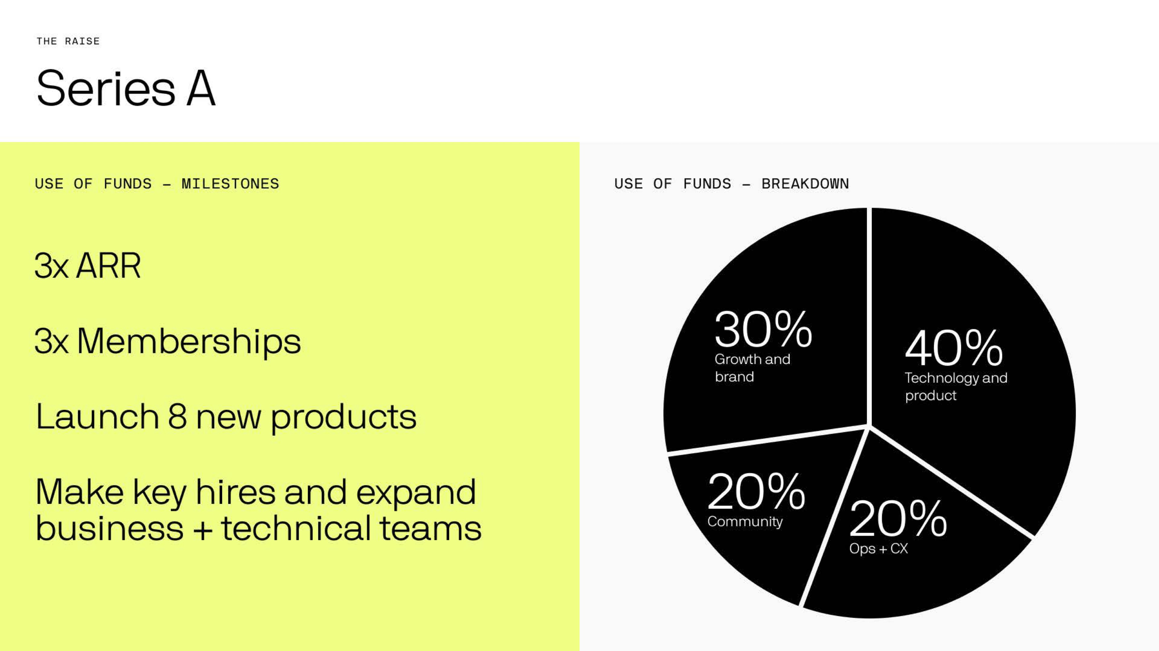
[Slide 28] Great use of funds slide. Image Credits: Rootine
I wish the company had included how much money it was raising on this slide to give it a sliver of additional context. But that’s an aside; I love the clarity here. Increasing ARR and membership numbers 3x and launching eight new products is a great set of goals. I wish the company had included deadlines (yes, 3x ARR … but when?), and “key hires” and “expand teams” are too fluffy. But most startups don’t include any of this, so very well done there.
One little detail, though: 30% growth, 40% tech, 20% community, 20% ops. Oops. I love the realism that everything in startups can run over budget, and I believe in the wisdom of raising more than you think you’ll need, but I’m pretty sure most investors would prefer the use of funds to add up to 100%.
As a startup, the lesson here is to show that you have clarity around why you are raising money, as well as what you’re going to accomplish with the money. It’s embarrassingly rare to see either of these things clearly outlined — and it’s literally the whole purpose of a pitch deck. Rootine’s example above is a good jumping-off point. Make it your own; make it good.
Traction galore
Rootine has a few traction slides in its deck (one that makes me unhappy, but we’ll get to that one), but I love how it flexes its numbers in various ways to show how well the company is doing. Slide 19 showcases some really cool traction:

[Slide 19] Holy traction, Batman. Image Credits: Rootine
An 18x increase in two years is objectively powerful. Not having numbers on the axes is a bit of a cheat (why‽), but the trend is clear, so that’s encouraging. The slide I really want to celebrate Rootine for, though, is the “summary” slide far earlier in the deck. Slide 2:
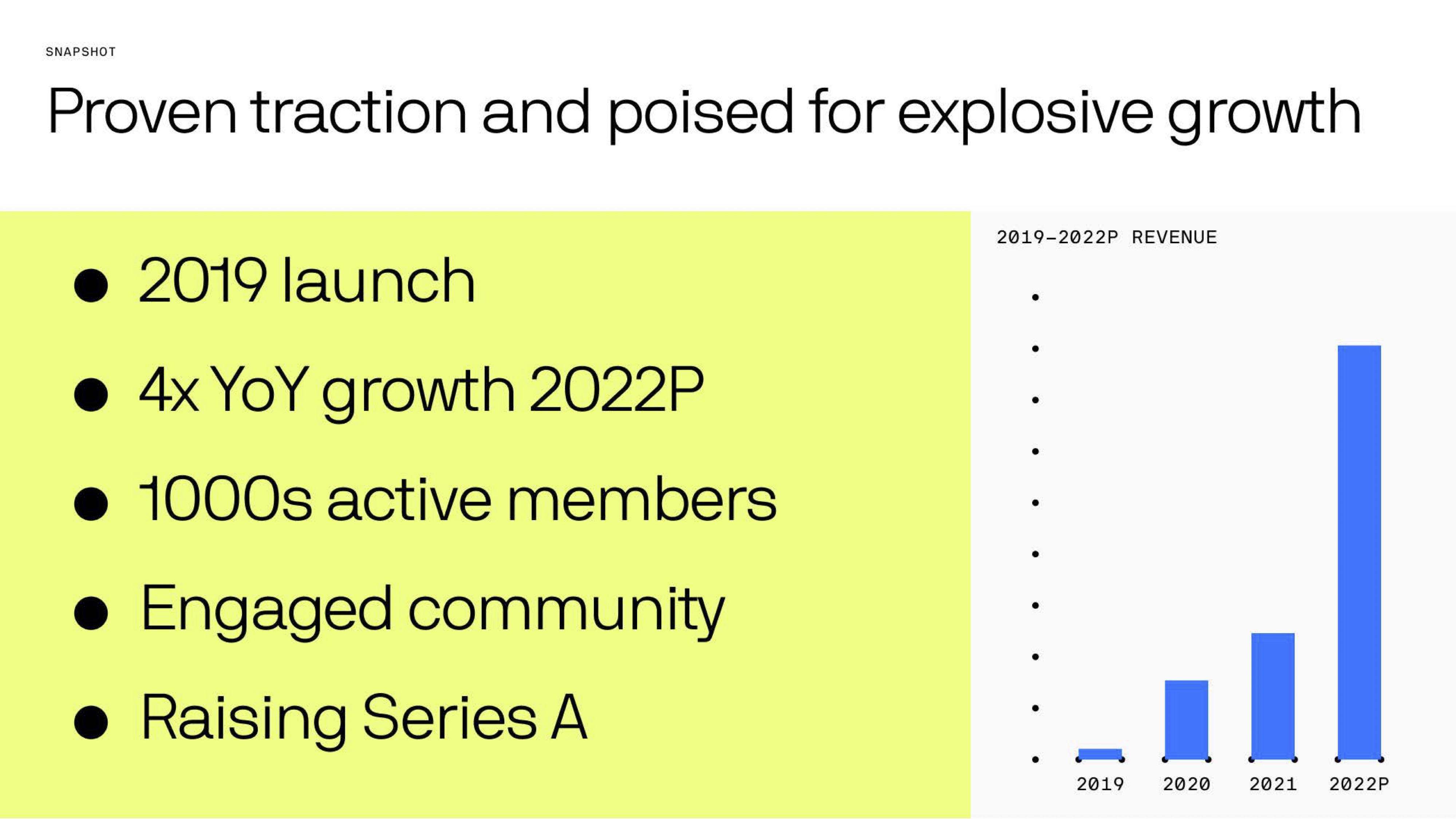
[Slide 3] Kicking off the story with a summary of the metrics. Image Credits: Rootine
I’m a sucker for a good business-by-the-numbers-type slide. I’m a little confused by the inconsistencies. TechCrunch reported that the company had 1,500 or so customers back in 2018, so the 2019 “launch” seems odd. It’s also risky to show projected numbers as part of slides; having it in two colors (blue for “real” numbers and perhaps gray for the projected numbers) might have felt more honest.
I’d also have liked to see more detail about the numbers behind the numbers. Acquisition costs, margins and all the numbers that drive a business forward. Especially at a Series A, where a company is explicitly setting itself up for growth, it would be good to have more detailed breakdowns of how the various key metrics have evolved over time.
How has the customer acquisition cost (CAC) evolved over time? How has the initial spend per customer and assumed lifetime value per customer shifted? What about the costs of goods sold (COGS), etc.? As an investor, this is where I would spend a lot of my due diligence time, so it makes sense to include most — if not all — of that as part of the presentation. If you’re positioning yourself as being ready for growth, show that the numbers support that!
As a startup, consider how you can use the numbers driving your company to tell the story, both of what you have done and what you are about to do. If you have meaningful numbers that truly show the growth of your company — use ’em to ram that point home. What you are doing is hard; brag, brag, brag!
The path to $1 billion
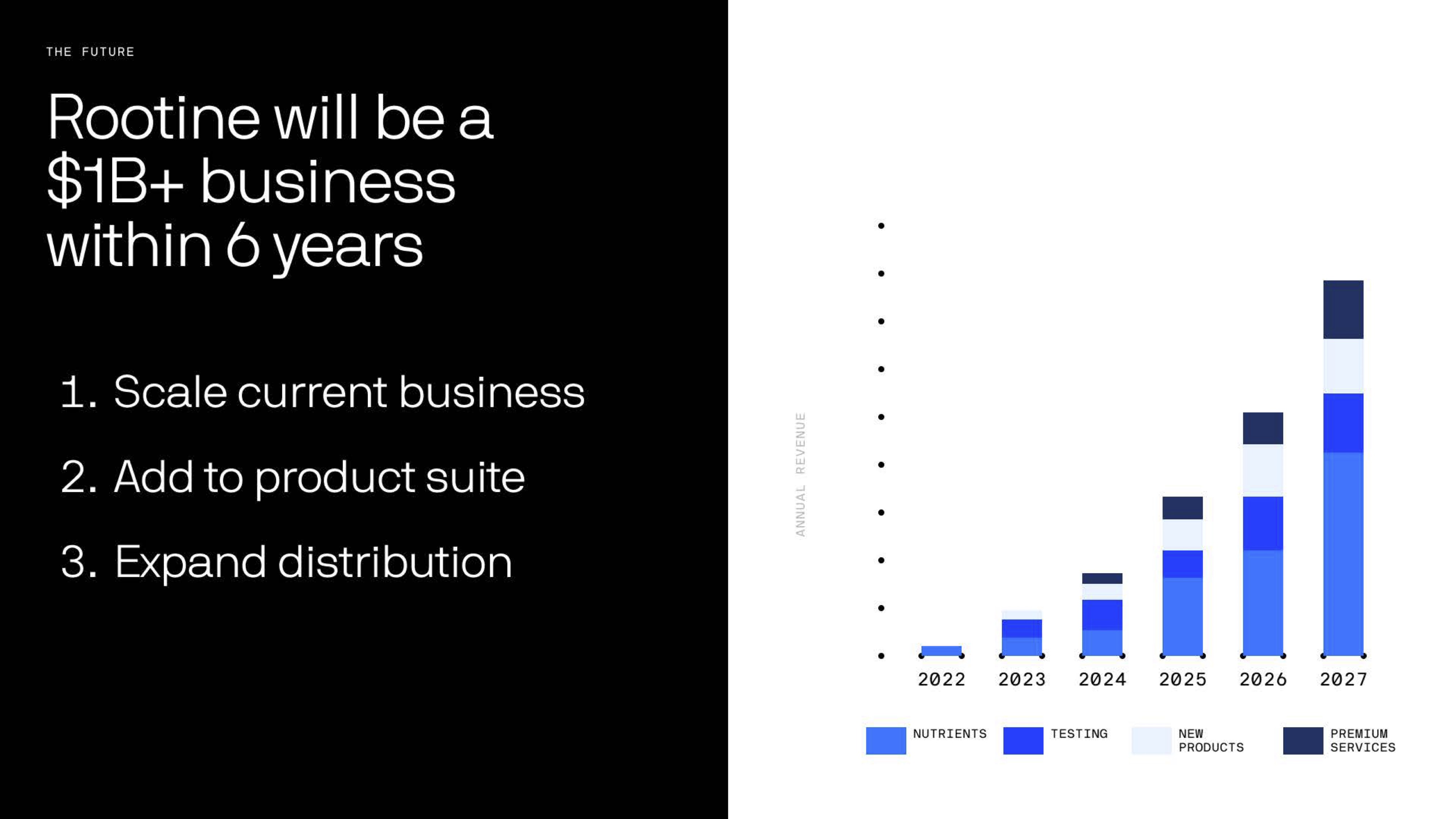
[Slide 25] That’s a bold claim. Image Credits: Rootine
The whole purpose of a startup is to scale outrageously fast. The exponential curve Rootine is showing in this curve looks impressive, and I am unsurprised that the investors got excited. I also suspect investors would ask how at this point. I think making a claim to be a $1 billion business within six years is bold and exciting. But you’d best show up with the receipts.
I hinted at that above; I’d want to see the numbers that drive this aggressive curve. Doubts aside; if you’re playing the VC game and you’re raising growth capital, this is precisely the sort of claim you need to be able to make, backed with some confidence and the numbers to back it up.
In the rest of this teardown, we’ll take a look at three things Rootine could have improved or done differently, along with its full pitch deck!
Pitch Deck Teardown: Rootine’s $10M Series A deck by Haje Jan Kamps originally published on TechCrunch

