Life has been pretty brutal in hospitality over the past couple of years, but that hasn’t stopped Mint House from bubbling to the top with a series of tech-forward apartments.
Under the slogan of “The comfort of home. The luxury of a hotel. Tech-enabled and tailored to you,” the company is trying to make being away from home a bit less crappy. Targeting high-end business and leisure travelers, Mint House recently raised a $35 million Series B from Mohari Hospitality, with participation from Revolution Ventures, Allegion Ventures and Ingleside Investors. In this teardown, we’ll take a closer look at the deck the company used to land its Series B.
We’re looking for more unique pitch decks to tear down, so if you want to submit your own, here’s how you can do that.
Slides in this deck
- Cover slide
- Summary slide
- Business model slide
- Consumer product slide
- Competitor comparison slide
- Key metrics slide
- Value proposition for real estate slide
- Results slide
- Corporate partnerships slide
- Team slide
- Appendices cover slide
- Case Study appendix slide
Three things to love
I’m curious how they raised this round, especially given that the deck has a Texas-sized red flag.
Raising $35 million in the hotel space at the tail end of a pandemic? Good heavens, I’m curious how they pulled that one off. That is doubly true given that the deck has a Texas-sized red flag on what is universally accepted to be one of the most important slides of any deck (more about that in the “things that could be better” section below.
But hey! That’s what we’re here to examine! Let’s start with the big wins:
Excellent 1-page summary slide
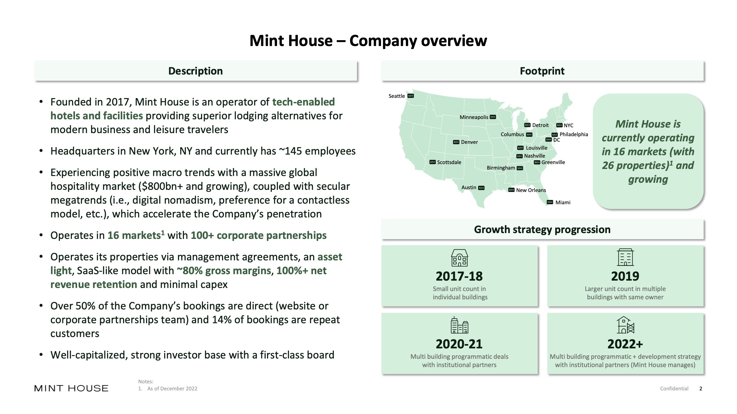
[Slide 2] Ugh, I love a good summary slide. Image Credits: Mint House
(opens in a new window)
I’ve made no secret of loving a good summary slide — it can really set the tone and pace of a presentation. This cover slide isn’t great to be used in a pitch setting; for presentations, I would probably recommend simplifying it further. But for a send-ahead deck, this gets investors up to speed very quickly and explains the macroeconomics of what the company is doing and its traction and progress to date and offers a brief summary of what the company is doing and whom they do it for.
I wish it also mentioned how much money it was raising, either here or on the cover slide — but apart from that, this slide is a beacon of perfection.
As a startup founder, the thing you can learn from this slide is how to get an investor filled in on the context for the company and the round at hyperspeed so you can focus the bulk of your pitch on the things that really matter: What you’re raising, what your plans are and where the market is going. This is particularly important for later rounds — dwelling on the past is important only to prove that you know what you’re doing. Investors are investing in what’s going to happen next, after all.
Front-load the longest pole in the tent
As a startup founder, you can probably predict what the biggest challenges are for the company you are about to pitch. In the case of Mint House, the third slide says something about what the company has been pushing against when it comes to investment. Hotels can be a lucrative business, but the business model is well-trodden ground. The company is promising to innovate on that model, and to investors, that’s both the biggest risk and the biggest opportunity.
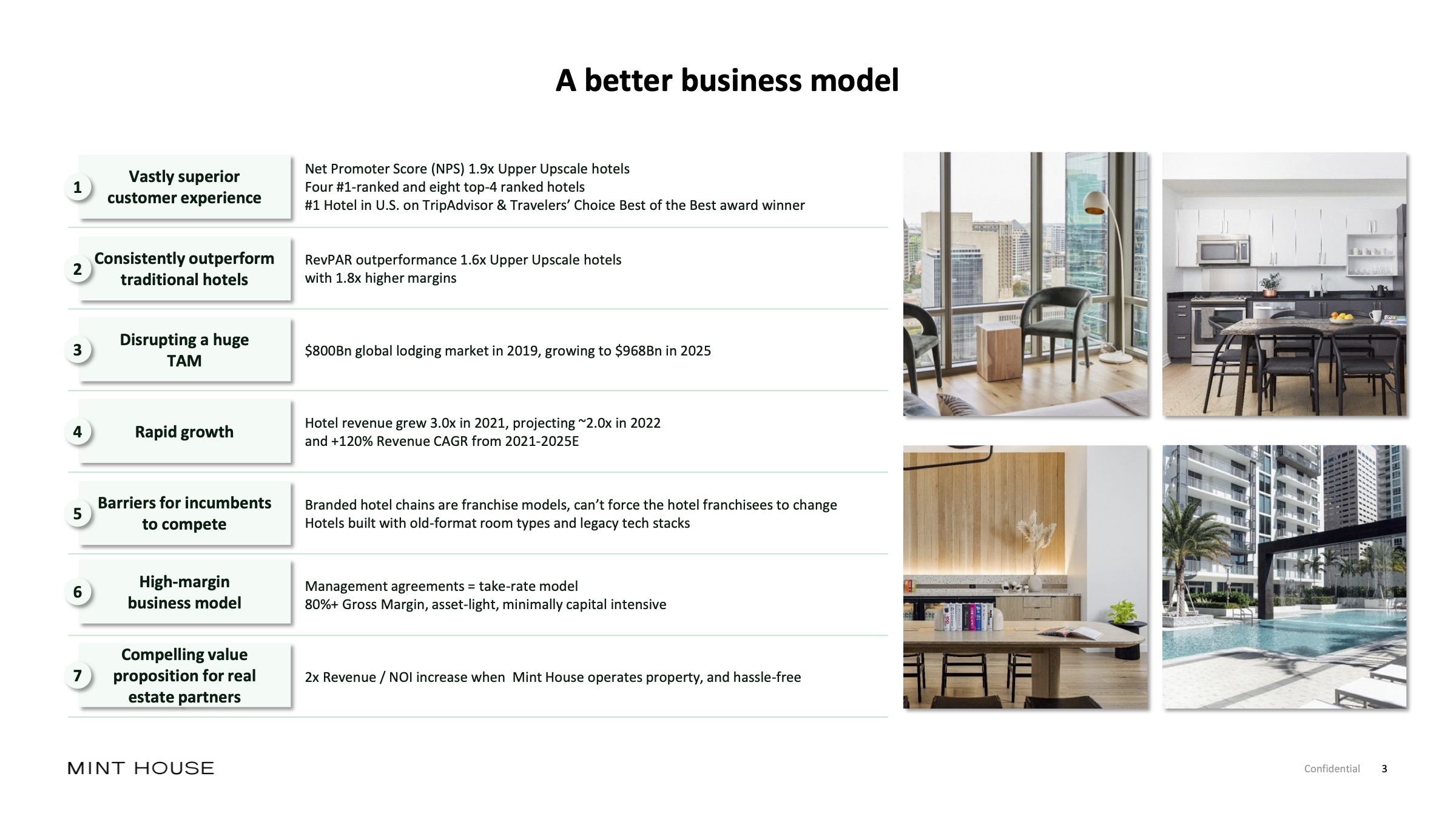
[Slide 3] Digging into the business model. Image Credits: Mint House
In the cutthroat world of hospitality, it’s fantastically hard to stand out, and nonspecialist investors often don’t even look at the vertical. Finding a way of telling the story well and clearly differentiating yourself from the status quo is a crucial part of telling the story. Mint House does that beautifully here, touching essentially every part of the business model on a single slide. Is the slide itself good? Not exactly — the text is so small it’s practically unreadable. But it does the job of summarizing the key differentiators really well.
As a startup, what you can learn here is how to differentiate yourself from a wall of incumbents. If you cannot, well, you essentially don’t have a business at all.
Show me the numbers!
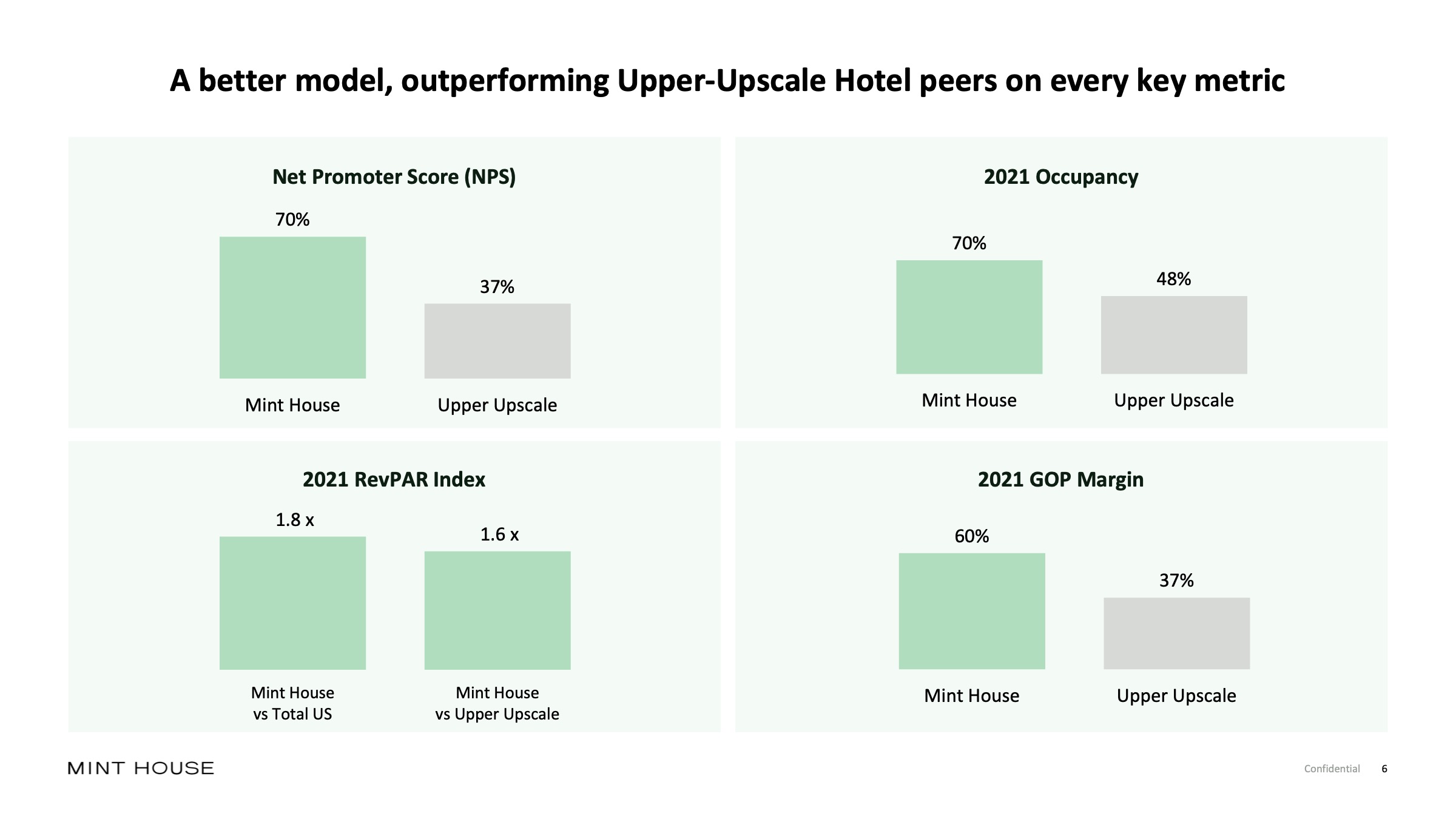
[Slide 6] Metrics for days. Image Credits: Mint House
Businesses that are in operating and scale-up mode have metrics. Not showing them in your pitch deck is very silly indeed and just as important as the numbers themselves are the numbers you select to represent your business to your potential investors.
The fact that this slide is here is great and encouraging — but investors are going to be looking very closely. Operating profit margin, revenue per available room and occupancy numbers are crucial for the operating side of the business. In other words: If you are in charge of growing and developing Mint House for the next three months, those metrics are crucially important.
However, those aren’t necessarily the metrics investors care about. I’d have expected to see graphs here, including revenue, occupancy over time and perhaps customer acquisition costs and other metrics that show what’s happening under the hood. Operational efficiency and cash flow might be another set of metrics worth a closer look.
The kind of metrics an investor would care about are directly linked to the fundraise itself. You’re raising $35 million? Great. Show what you’re going to do with the money and what the major milestones are for the next six to 18 months in the form of an operating plan.
There’s a deep orange, if perhaps not red, flag here, too, though: The net promoter score is represented as a percentage, which is incorrect. NPS is an absolute number ranging from -100 to 100, calculated using a formula you can find on every growth-hacking blog that ever existed. The fact that the founders (and everyone who looked at this deck) didn’t catch that — along with the strangely not-quite-right selection of metrics above — makes me wonder about the quality of the overall team.
Where my mind goes here is whether the team is made up of tech startup founders or hotel operators. Nothing wrong with being the latter, but Airbnb is able to run with much better profit margins than someone who is operating a suite of dozens of brick-and-mortar buildings. I’m not saying that this wouldn’t be a good investment, but I question whether it makes sense as a VC investment.
In the rest of this teardown, we’ll take a look at three things Mint House could have improved or done differently, along with its full pitch deck — and that big red flag I mentioned earlier.
Three things that could be improved
As good as Mint House’s pitch deck is, there are a few things that made me scratch my head — some mistakes that are serious enough that I was kinda curious how the company was successful in raising at all, if I’m being honest. Let’s take a look.
Pitch Deck Teardown: Mint House’s $35M Series B deck by Haje Jan Kamps originally published on TechCrunch

