There’s no shortage of “upskilling” startups out there, but it’s rare to see one raise a $41 million round. That’s what Spanish startup StudentFinance pulled off a couple of weeks ago. Today, we are taking a closer look at the pitch deck the company used to make that happen.
We’re looking for more unique pitch decks to tear down, so if you want to submit your own, here’s how you can do that.
Slides in this deck
StudentFinance shared a slightly redacted slide deck; it removed sensitive revenue, cost and unit economics slides. Everything else is as pitched.
- Cover slide
- Mission slide
- Opportunity slide
- Problem slide
- Solution slide
- Value proposition slide part 1
- Value proposition slide part 2
- Business model slide
- Technology slide
- Metrics slide
- Road map slide (labeled “expansion” slide)
- Geographic expansion slide (labeled “expansion” slide)
- Growth history and trajectory slice (labeled “expansion” slide)
- Team slide
- Contact slide
Three things to love
To raise a $41 million round, a company needs solid traction and a huge market. I’m unsurprised to see that those parts of the story, in particular, were very well covered.
Clear, bold mission

[Slide 2] Off to a solid start. Image Credits: StudentFinance (opens in a new window)
Company-building is future-building, and being able to have a clear vision for the future is a crucial part of that. StudentFinance’s second pitch deck slide sets the tone for what’s about to come: It’s a BHAG, as it’s called in the industry —a big, hairy, audacious goal. StudentFinance has great clarity about what they are building and who they are building it for, and it really helps investors co-dream with the founders.
This slide invites investors to join the journey, something all startups should do when pitching. What is the big goal, the big change you want to see in the world? Bring that to life, and you’ve made a great first impression.
A clearly formulated problem space

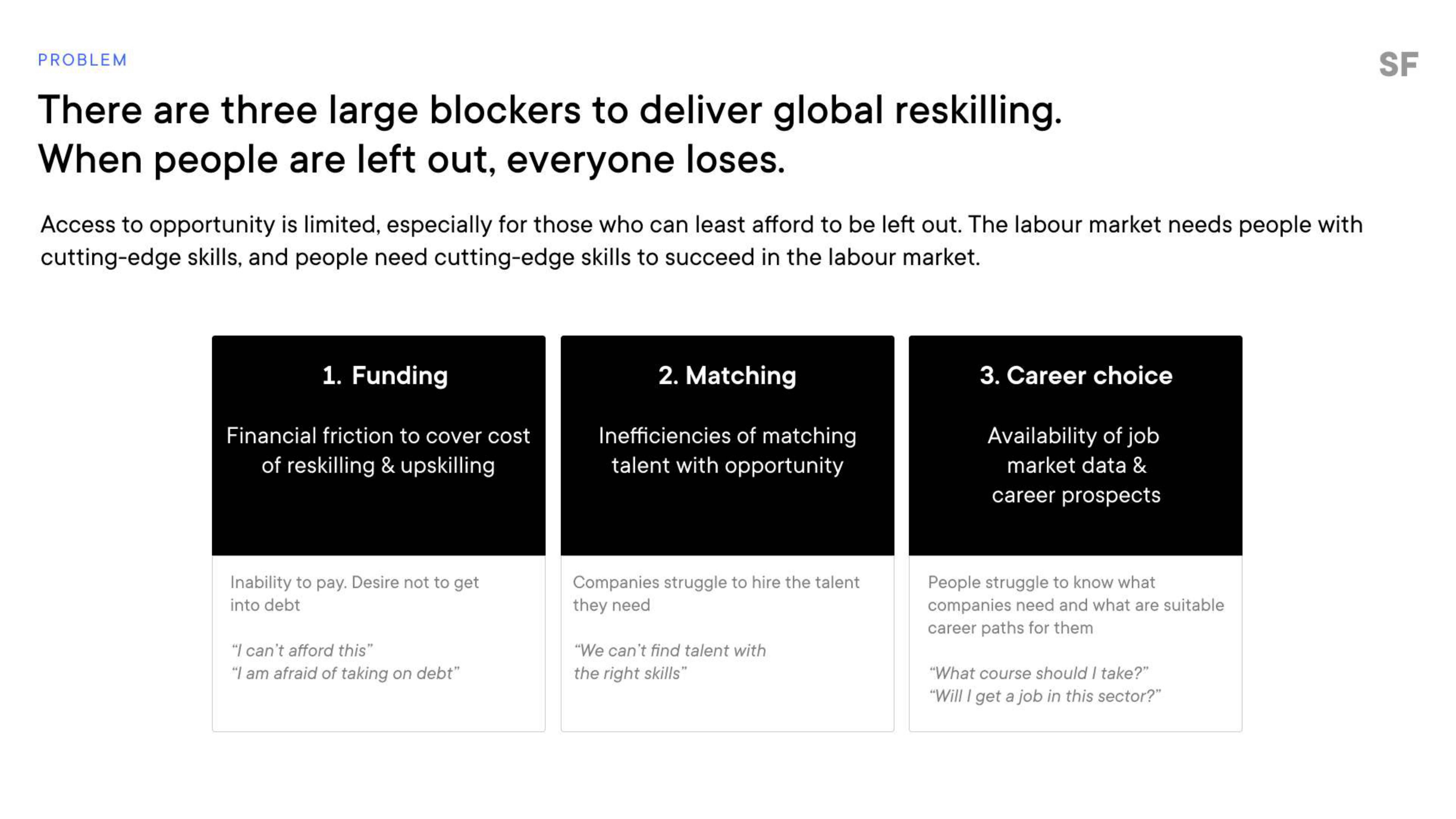
[Slide 4] Gotta love a clear problem. Image Credits: StudentFinance
The company goes from a great mission to discussing what the opportunity looks like. From there, it moves on to this slide, talking about the three big problems getting in the way of a global, comprehensive approach to upskilling. Having a clear, well-articulated problem statement goes a long way toward helping an investor get a feeling for how big, how serious and how urgent the problem is. Ideally, it should also hint at how prevalent the problem is (i.e., how many people are experiencing it).
Breaking down the problem into three easy-to-grasp segments like this is particularly elegant. Funding is an obvious one‚ people are worried about money — but finding jobs and getting career guidance are less obvious slices of this challenge at first glance. Bringing it to life by using the short example questions underneath helps humanize the problem. All very well done.
Promising early metrics
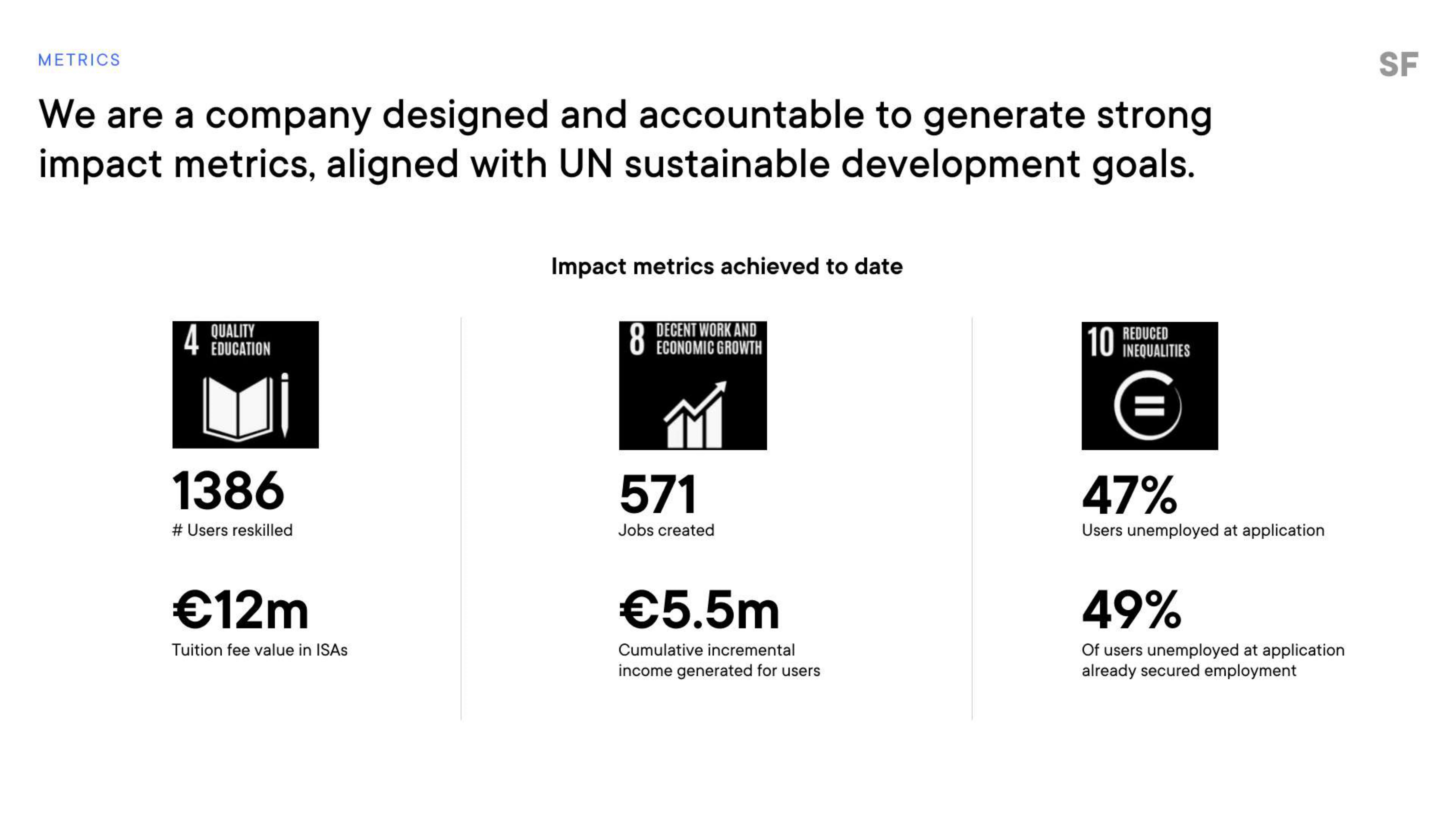
For a company raising more than $40 million, I would have expected pretty beefy metrics. Of course, I have nothing to benchmark it against, so I don’t know if these metrics are actually good or great, but the investors must have seen something. The win here, though, is identifying and reporting on metrics that seem key to the company:

[Slide 10] Metrics, metrics, metrics. Image Credits: StudentFinance
Some crucial numbers are missing here, and in any other circumstance, I would give the founders a hard time.
You can tell a lot from a company’s metrics — both the KPIs themselves, of course, but also the figures that a company believes are key to its growth. StudentFinance overlaps these metrics on the UN sustainable development goals, which is a great way to signal how it can be a force for good in the world. Again, elegantly done.
The number of people reskilled and the value of tuition fees are both crucial numbers (although I can’t figure out what ISA stands for, so perhaps there’s an opportunity for a tweak there). Job creation, salary generation and finding that half of the folks who go through the program land jobs are all key indicators that make a lot of sense.
Some crucial numbers are missing here, and in any other circumstance, I would give the founders a hard time, but the team already let me know that “sensitive revenue, cost and unit economics slides” had been removed — and those are exactly the type of metrics that I would like to see here.
In the rest of this teardown, we’ll take a look at three things StudentFinance could have improved or done differently, along with its full pitch deck!
Pitch Deck Teardown: StudentFinance’s $41M Series A deck by Haje Jan Kamps originally published on TechCrunch


