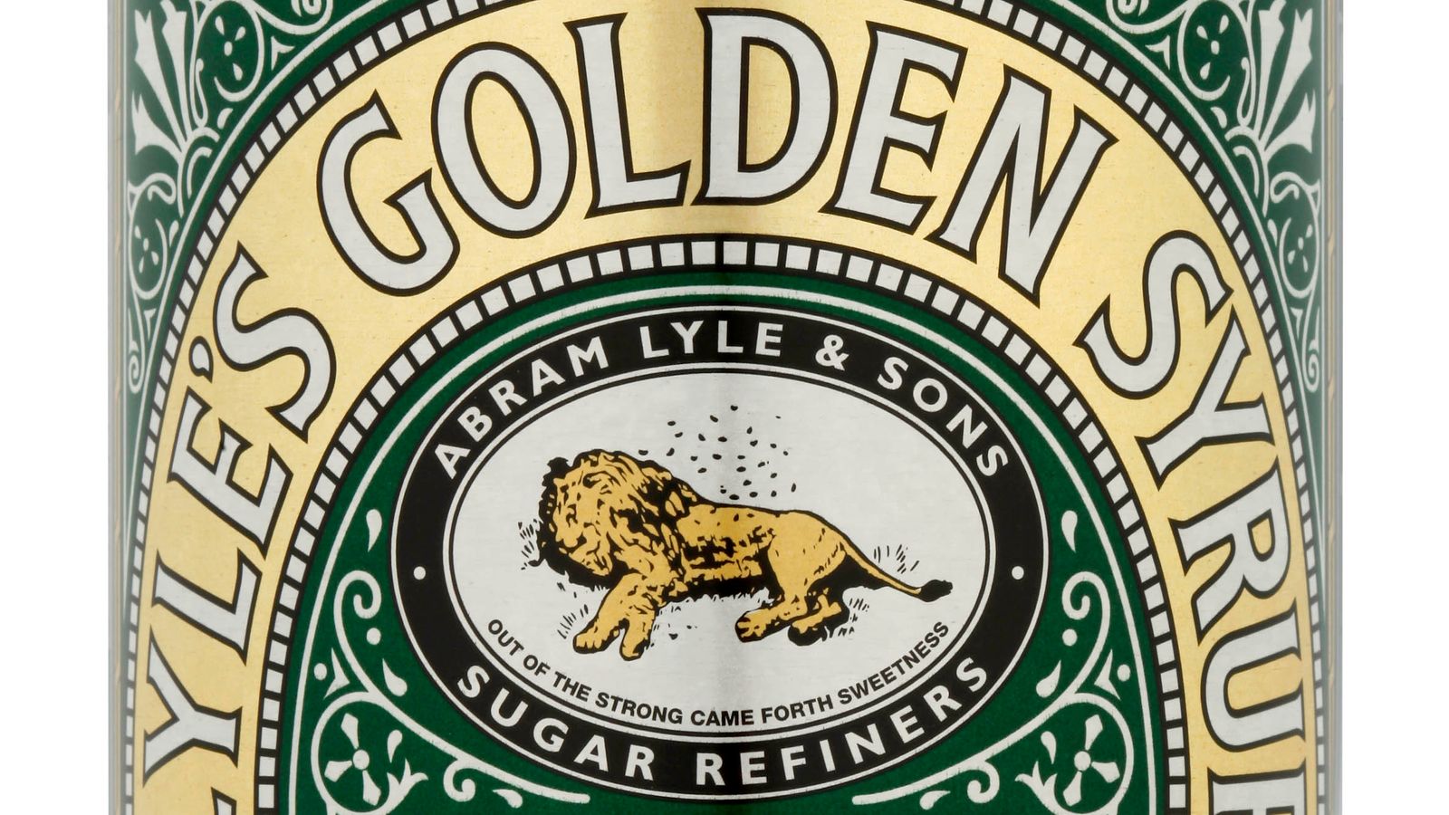
Lyle’s Golden Syrup is replacing the image of a dead lion swarmed by bees on its logo with a new design on many of its products after more than 140 years.
The famous green and gold tin holds the Guinness World Record for the oldest unchanged brand packaging and hasn’t been altered since 1883.
Scotsman Abraham Lyle, who founded the product, was inspired by a Bible story in which Samson kills a lion and returns to find bees have built a hive in its carcass.
The product’s tagline – ‘Out of the strong came forth sweetness’ – alludes to Samson’s riddle to his wedding guests about the source of the honey.
The rebrand will affect most products in the company’s range, for example, Lyle’s various plastic bottle versions, but the classic tin will keep the original design.
Lyle’s said it wanted to “refresh the brand’s legacy to appeal to a 21st-century audience”.
Read more from Sky News:
The Body Shop to shut half of its stores
Body found in search for Clapham chemical suspect
Be the first to get Breaking News
Install the Sky News app for free
“While we’ll continue to honour our original branding with the heritage tin, consumers need to see brands moving with the times and meeting their current needs,” said brand director James Whiteley.
“Our fresh, contemporary design brings Lyle’s into the modern day, appealing to the everyday British household while still feeling nostalgic and authentically Lyle’s.”


