The award for the best/worst startup name I’ve seen in a while goes to Oii.ai. This company’s name is weird enough that Google Chrome insists on doing a search for the term “oii.ai’ when you type the URL into the address bar. In any case, a confusing name doesn’t mean it’s a bad business.
The company claims it raised a $1.85 million seed round with this deck. We didn’t cover this round, and the company is tight-lipped about who its investors are, but the deck was interesting enough that I’m choosing to break my usual rule of needing press coverage to do a pitch deck teardown.
We’re looking for more unique pitch decks to tear down, so if you want to submit your own, here’s how you can do that.
Slides in this deck
Oii.ai has an 18-slide deck plus a couple of appendix slides. Some of the slides have been lightly redacted, but the company says it is including every slide so we can get a full picture of the deck that helped it close the round.
Here are the slides:
- Cover slide
- Vision slide
- Interstitial slide
- Overview slide (“Welcome to Oii”)
- Solution slide? with a side of business model slide
- Problem slide?
- Market trend slide
- Traction slide
- Team slide
- TAM slide 1 (Pharma sector)
- TAM slide 2 (Retail sector)
- Market overview + competitive landscape slide
- Competitive advantage slide
- Sales pipeline slide
- Product roadmap slide
- The Ask + Opportunity slide
- Use of Funds slide
- Closing slide + contact detail slide
- Appendix slide 1: Competition (Llamasoft)
- Appendix slide 2: Competition (Llamasoft)
- Appendix slide 3: Acquisition opportunities
Three things to love
I have to admit that I’ve rarely found it as hard to categorize slides as I did with this deck. The information isn’t organized the way I would expect. It does work sometimes, but it often does not.
Excellent ‘what we want to change’ narrative
This slide paints a concise and clear picture of the change Oii wants to see in the world. It’s a simple and effective way to show why the company needs to exist.
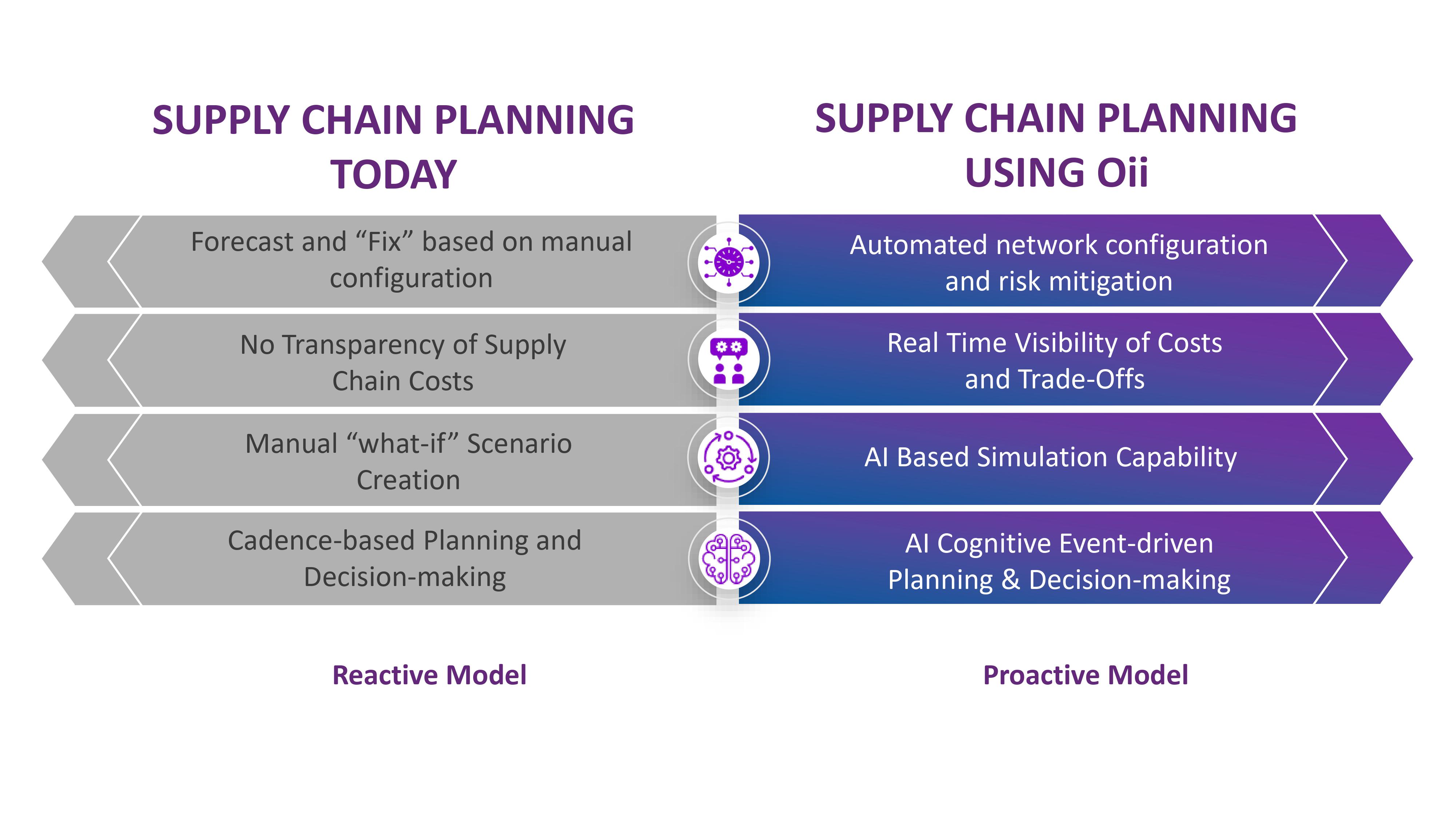
[Slide 6] An unusual take on the value proposition slide. Image Credits: Oii.ai
This slide is unusual because it falls somewhere in the middle of the problem, solution and value proposition narrative. In this case, it works because it helps draw a clear line between what the company is seeing in the world right now and the future it envisions.
I like the creative approach and can see this type of slide being more commonly used in the future.
A good take on early-stage traction
The company doesn’t have much in the way of traction, but it does avoid falling into the trap of leaning into vanity metrics:
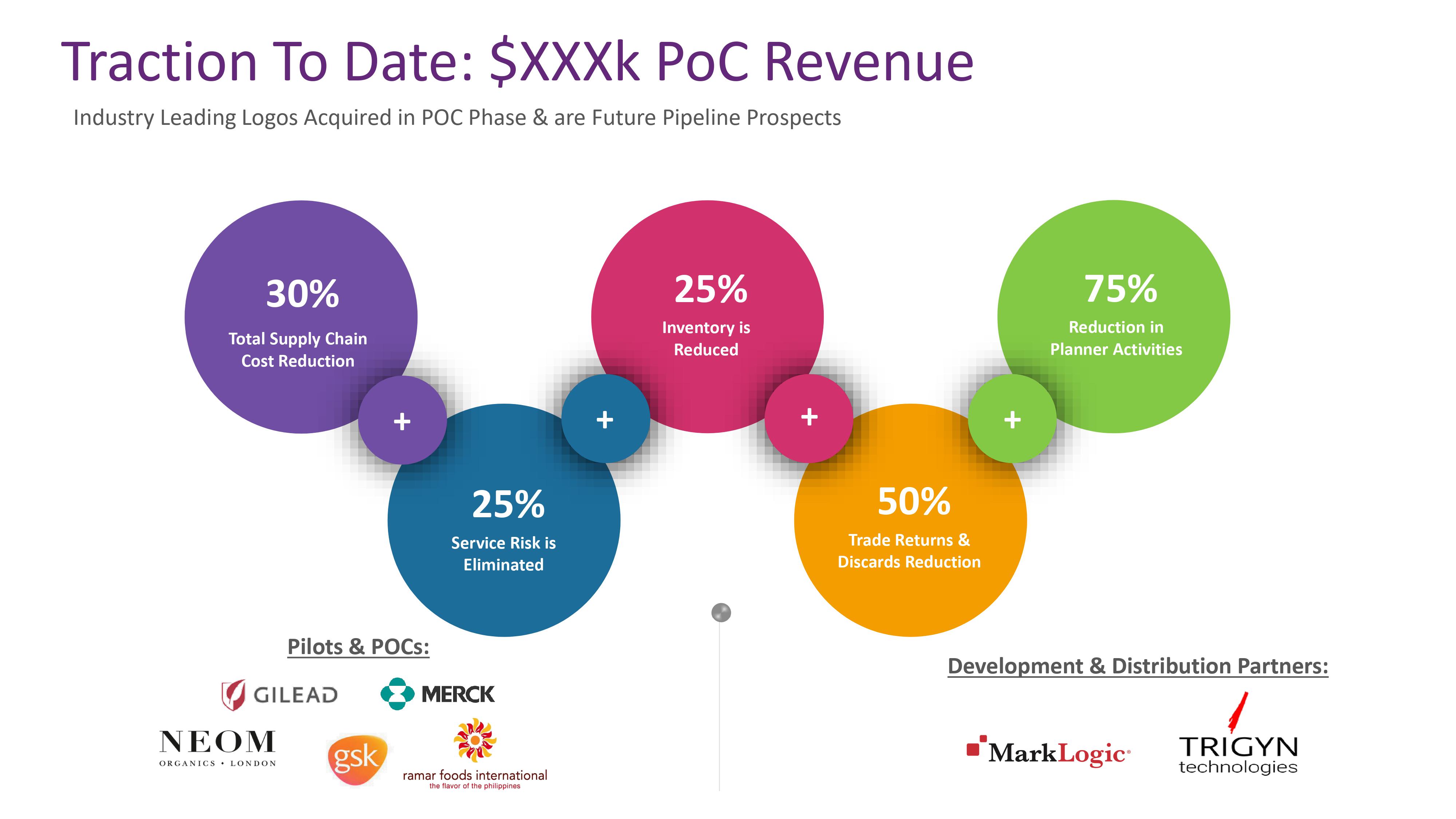
[Slide 8] Here’s some traction for ya. Image Credits: Oii AI
It took me a couple of moments to realize that PoC probably meant proof of concept rather than people of color; I do enjoy brevity on slides, but I also think that you can afford to spell out abbreviations.
Now, technically, only the top-level revenue number is the one with the actual traction; the other figures are all benefits and value propositions. The traction that flows from these numbers is efficacy, so the story here is, “In our proof-of-concept phase, we generated X amount of revenue and were successful in proving that our product works.”
In most cases, graphs that show revenue growth over time are better than snapshots when it comes to traction. Having said that, I appreciate how hard it is to show traction as an early-stage startup, and this slide actually does better than most, so we’ll chalk this one up as a win.
Overall, good visual storytelling
I like that this deck has clearly had some design attention and that it relies on imagery to tell its story. Good images go a long way in helping a deck come to life, and from that perspective, Oii AI’s deck is pretty compelling. Colorful images and fun design choices all work in its favor.
Although, if I were to pick a nit…

[Slide 3] The future looks retro. Image credit: Oii AI
If you are building the cutting edge of AI to disrupt an industry, maybe don’t use a stock image of a GPS device that nobody has used since Apple introduced built-in GPS with the iPhone 3G in 2008.
In this case, I believe the device pictured is one of the Garmin Nuvi 700-series, which was launched the same year as Apple started putting GPS into iPhones, and was essentially the beginning of the end for the entire category. Visually aligning your company with a product category that met its very public and extremely painful demise 15 years ago may not send the right message.
In the rest of this teardown, we’ll take a look at three things Oii AI could have improved or done differently, along with its full pitch deck!
Pitch Deck Teardown: Oii.ai’s $1.9M Seed deck by Haje Jan Kamps originally published on TechCrunch

